Makenna baylor
Close
Menu
Close
Project overview
Problem
Texas A&M University’s significant growth has led to increasingly long in-person lines at on-campus dining locations. To address this challenge, a mobile ordering system via the Transact Mobile Ordering app, implemented by Texas A&M through Aggie Dining in 2022 to allow students to order ahead and bypass wait times. Despite the aim to encourage students to ‘skip the line and order online,’ the current Transact app is underutilized in the student population and fails to provide needed relief due to its interface and limited customizations.
Goal
As a UX Designer, my primary objective for this project was to elevate the quality of each stage in the design process, supporting my ongoing professional development. Serving as a graphic designer for Aggie Dining gave me the unique opportunity to interview current Transact users, enabling me to craft a user-centered redesign tailored specifically for Texas A&M students. I also aimed for my work to inspire Aggie Dining to consider incorporating some of my ideas into the existing Transact app for the benefit of future students.
my role
As the sole designer on this project, I guided all phases—from UX research, user surveys, and user flows to persona development, wireframing, and high-fidelity design. To ensure my solutions were developer-ready, I regularly consulted with industry mentor Taylor O’Neill, whose feedback both supported my vision and constructively challenged my approach. Although I collaborated closely with Aggie Dining, the on-campus dining provider, the Transact redesign could not be implemented due to an existing contractual agreement between Texas A&M and Transact.
Research & Discovery
Literature Analysis
Before distributing a survey to current Transact users, I sought to deepen my understanding of the food mobile ordering industry, with a particular focus on in-app services. My comprehensive literature review covered topics such as mobile app design assessments, common interface issues, key features of ordering apps, and how interface design impacts service experience. Most of the studies I reviewed were conducted post-COVID, reflecting the surge in on-campus mobile ordering during that period. Notably, Texas A&M only adopted a mobile ordering service beginning in fall 2022.
The analysis highlighted five key aspects for adjusting and applying the development of a food mobile ordering app redesign: designing assurance and evaluation, marketing/users/personas, pricing/promotions/transparency, the ordering process, and retention/experience.
Designing Assurance & Evaluation
Emphasized simplicity and user-friendliness through straightforward and intuitive interfaces for smartphone applications.
One of my goals was to fully redesign the ordering process and interface to streamline the experience, recognizing that students frequently place food orders while walking across campus.
Interfaces should be simple, focused on one task, visually pleasing, learnable, intuitive, and glanceable.
Key user preferences identified in the literature include clear and simple menus, straightforward navigation, and the ability to quickly obtain information such as restaurant details and order tracking.
Consistency with industry standards for interactions, including touchscreen gestures, helps ensure interactions occur as users expect.
For first time users, incorporating features like an interactive welcome mat on the app’s first screen can make it more inviting and helpful.
Marketing, Users, & Personas
The literature review suggested ways to market the app and create accurate user personas, recommending techniques like scenarios and listing key characteristics of users when starting development.
My note
Cultural and social influences, such as the perspectives of others and the influence of social media among college students, are important factions affecting technology acceptance and need to be considered in design.
my note
Pricing, Promotions, & Strategy
Promotions and financial incentives are needed to encourage users to adopt MFOAs and perceive them as cost effective.
my note
Encouraging user reviews is essential for continuous improvement, building trust, and helping customers make informed decisions by providing social proof.
my note
meal plan note
my note
Ordering Process
Literature focused on improving the ordering process experience, highlighting personalization (recommendations, discounts) and key features like promotions, payment choices, and pricing/affordability as highly valued by users.
my note
Other critical elements for MFOAs include security of personal information, accessible payment gateways, real-time order tracking, customer service, easy navigation, and search functionality.
my note
Accommodating different price models and services, such as on-campus meal plans and credit cards, is crucial for flexibility and meeting diverse student needs.
my note
retention & experience
Improved UI enhances the overall UX and contributes significantly to repurchase intentions, with navigation clarity, structured layout, visual appeal, and ease of interaction fostering trust and reliability.
my note
Good UI/UX combined with improved service quality heighten user engagements and influence positive user reception.
While my redesign cannot directly enhance service quality through better ingredients or staffing, it can impact how the app communicates custom orders to staff by implementing effective system changes.
Negative experiences with mobile applications due to the difficulty of use can cause the user to quit or remove the app from their device.
The current Transact app contains several problematic user flows that force users to restart their orders without intentionally removing items. Additionally, the order time estimates were often inaccurate, resulting in longer waits than expected. Simplicity is crucial, as a complex user interface can lead to customer impatience and negative impact purchases.
User-friendly interfaces are vital for building brand value and expanding the user base, as confusion or difficulty with the UI are significant reasons why users stop using food delivery apps. (Titus et al.)
my note
The interplay between UI and service quality is important, and optimizing both leads to increased satisfaction, repurchase intentions, positive word-of-mouth, loyalty, and success.
my note
Limitations like limited payment options, difficulty ordering from multiple vendors in one transaction, and menus without food photographs negatively affect user experience.
my note
A robust reward system, potentially incorporating gamification elements like points or leaderboards, is essential for incentivizing continued use, increasing engagement, fostering loyalty, and attracting new customers.
my note
Better payment services led to high satisfaction levels among users. (Chan et al.) Prompt order processing and accurate delivery times are crucial for user satisfaction and retention.
my note
User retention and loyalty depend on trust, which is built through providing high-quality, accurate information that reduces uncertainty and maximizes satisfaction.
my note
user survey
overview
The exploration involved conducting a campus-wide user survey to gather data on current pain points, desired potential features, and other opinions from the target audience of Texas A&M students who use the Transact mobile ordering app.
Aggie Dining Connection
Collaboration with Aggie Dining provided access to the current Transact user base, enabling the distribution of a targeted survey to gather user feedback.
194 responses
The survey collected a total of 194 responses, which I analyzed to identify key user segments and their specific needs and challenges.
Three personas
The analysis of survey responses allowed for the categorization of users into three primary personas based on their frequency of app use: the daily user, the weekly user, and the monthly user.
organizing the questions
Drawing from insights gained during the literature review, I structured my questions into six key sections: user understanding, interface design, user experience, functionality, service quality, and marketing/promotions. Since Transact holds a contract with Texas A&M University, I was mindful to design the questionnaire—distributed by Aggie Dining—in a way that avoided any conflict of interest for their client. My goal was to gather meaningful feedback while maintaining neutrality and avoiding any implication of criticism or promises to resolve existing issues.
How often do you use our food ordering app?
- Daily
- 2-3x per week
- Once a week
- A few times per month
- Rarely
What is the primary reason you use our app?
- Convenience
- Timesaving
- Variety of restaurant options
- Exclusive deals/discounts
- Other (please specify)
What is the primary factor that influences your choice of restaurant when ordering?
- Price
- Location
- Estimated Time
- Cuisine Type
- Familiarity with the Restaurant
- Other (please specify)
On a scale of 1-5, how easy is it to navigate our app? (1 being very difficult, 5 being very easy)
What feature of our app do you find most useful? Rate the importance from most to least
- Menu Browsing
- Customization options for orders
- Variety of payment methods
- Order tracking
- Rewards and Contests
- Other (please specify)
What is the biggest challenge you face when using our app? Rate the importance from most to least
- Limited Food Customization
- Ordering from Multiple Restaurants
- Accuracy of Food Order
- Other (please specify)
How satisfied are you with the descriptions and photos of the menu items?
- Very satisfied
- Satisfied
- Neutral
- Dissatisfied
- Very dissatisfied
On a scale of 1-5, how satisfied are you with the order customization options? (1 being very dissatisfied, 5 being very satisfied.
In-app ratings of menu items and restaurants would encourage you to order a different or new menu item.
- Strongly Agree
- Agree
- Neutral
- Disagree
- Strongly Disagree
How important is the ability to track your order in real-time?
- Very important
- Important
- Neutral
- Not very important
- Not at all important
How satisfied are you with the accuracy of estimated delivery times?
- Very satisfied
- Satisfied
- Neutral
- Dissatisfied
- Very dissatisfie
Current in-app promotions influence your decision to order online.
- Strongly Agree
- Agree
- Neutral
- Disagree
- Strongly Disagree
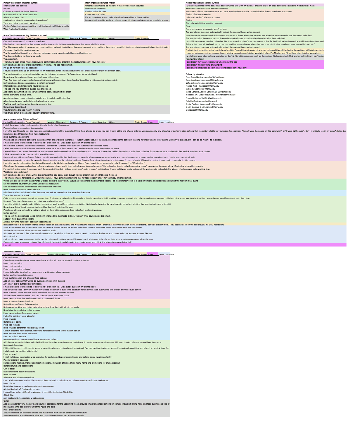
Have you experienced any technical issues while using the app in the past month?
- Yes (please specify)
- No
Is there anything else you'd like to share about your experience with our app or suggestions for improvement?
(Open-ended question)
What additional feature would you most like to see added to the app?
(Open-ended question)
How likely are you to recommend our app to a friend?
(0-10 scale, Net Promoter Score)
Would you be interested in a follow up interview?
- Yes (name and email)
- No
analyzing the responses
Over a 10-day period, I collected 195 high-quality responses. To maintain the integrity of my analysis, I excluded any submissions that contained only ‘perfect’ scores and were clearly not completed thoughtfully. Additionally, for questions rated on a 1–5 scale (with five being the most important), I identified and adjusted responses where students had mistakenly reversed the scale, ensuring that the resulting averages accurately reflected user sentiment.
Once I had established accurate averages, I analyzed patterns across different questions to identify common themes and priorities. For example, I compared frequency of use with the features users valued most, and examined the relationship between motivation to use the app and the most frustrating aspects identified. I also contrasted open-ended feedback on frustrations with the ranked importance of features. Notably, while Promotions and Rewards ranked as moderately important in quantitative responses, they emerged as the most frequently requested area for improvement in open-ended feedback.
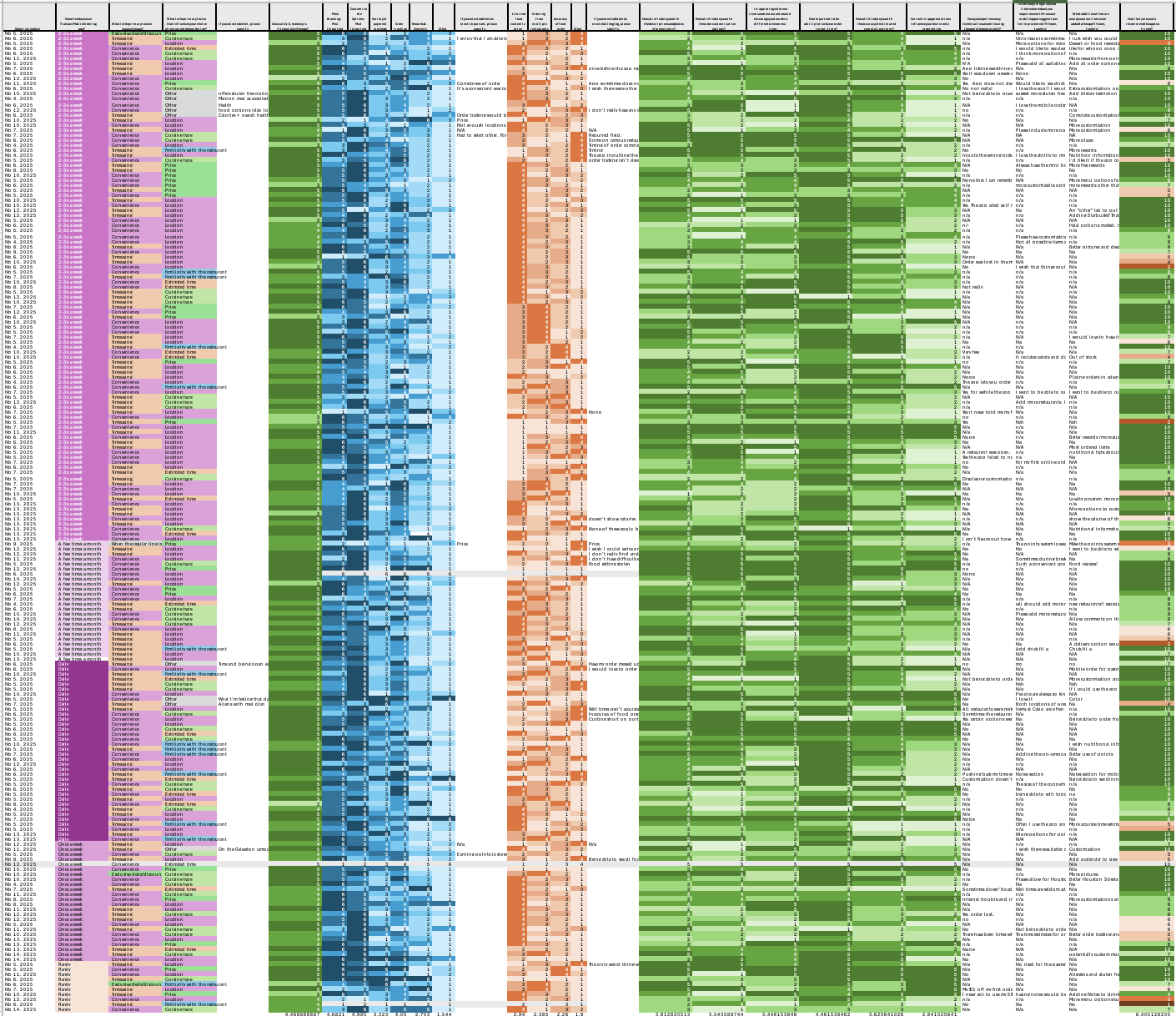
Spreadsheet of all User Responses
Color code of free response answers for survey categories
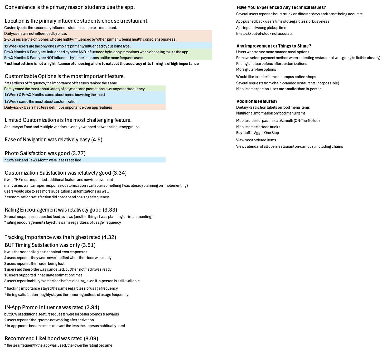
Final Takeaways *bulleted below
Convenience is the primary reason students use the app.
Location is the primary influence students choose a location.
Cuisine type is the secondary influence.
Daily users are not influenced by price.
Weekly users are the only ones who are primarily influenced by cuisine type.
Few x a month and Rarely users are influenced by price.
They are also influenced by in-app promotions when choosing to use the app.
Few x a month and Rarely users are not influence by 'other' reasons.
2-3x per week users are the only ones highly influenced by 'other', primarily being health concerns.
Customizable Options is the most important feature.
Users that used the app rarely cared the most about variety of payments and promotions over any other user frequency.
Weekly and Few x per month users cared about menu browsing the most.
Weekly users cared the most about customization.
Daily and 2-3x per week users had less definitive importance of app features.
Customization Satisfaction was Okay (3.34/5)
Customization was THE most requested additional feature for new improvement.
Many users want an open response customization feature. (Something I was already planning on doing)
Users would like to see more substitution customizations.
Customization satisfaction did not vary depending on app usage frequency.
Tracking Importance was the highest rated (4.32/5)
HOWEVER Timing Satisfaction was only (3.51/5)
Tracking was the second largest technical error response.
4 users reported they were never notified their order was ready
10 users reported inacurate estimation times
3 users reported their order being lost
1 user claimed their order was cancelled, but then notified their food was ready
3 users stated inability to order food online when ordering in-person was still open
Tracking importance stayed consistent regardless of app usage frequency.
Timing satisfaction stayed consistent regardless of app usage frequency.
In-app Promo Influence was rated 2.94/5
16% of additional feature requests were for better promos and rewards.
2 users reported promo did not apply after activation
In-app promo became more important as app usage frequency decreased.
Limited Customizations is the most challenging feature.
Accuracy of Food and Multiple Vendors evenly swapped between frequency groups.
Photo Satisfaction was Good (3.77/5)
Weekly and Few x per month users were least satisfied.
Recommend Likelihood was rated 8.09/10
The less frequent the app usage, the lower the rating.
Ease of Navigation was Easy (4.5/5)
building the personas
In analyzing the responses, I found that frequency of app usage was the strongest indicator of response similarity. With this insight, I compared and calculated the averages for each question based on users’ frequency of use, allowing me to identify trends among different user groups. These averages directly informed the development of my personas, shaping their motivations, needs, and frustrations. Ultimately, this analysis validated my decision to group personas by frequency of use rather than by other attributes.
personas
overview
Each persona articulated distinct needs and motivations for app improvements and factors that would encourage more frequent use. Understanding different stakeholder groups and their varying perspectives is vital in human-centered design
the daily user

Daniel Rodriguez, 18
Freshman in Engineering
Lives on campus
All classes on Main Campus
Not a picky eater
About
Daniel is a freshman in the Corps of Cadets living on campus with a required meal plan. As an engineering student, he spends most of his time on campus and uses the app daily. With his busy schedule, Daniel seeks diverse meal options through Maroon Meals and desires an improved rewards system for frequent users of Transact Mobile Ordering. He values quick and convenient meal options that fit his hectic lifestyle.
motivations
Convenience
Inn-app reviews
Rewards & recognition
goals
Easily track meal plan balance
Explore new menu items
Earn & redeem rewards
Find restaurants that are currently open
pain points
Limited menu options for specific meal plans (e.g., Maroon Meals)
Long process to find and view dining balance.
Unclear or outdated menu and hours information
Lack of variety or transparency
needs
A well-functioning, balanced app
Improved rewards system
Easy access to meal plan tracking
Comprehensive menu information
the weekly user

Amara Bashar, 20
Junior in Biology
Lives off campus
Most classes on Main Campus
Needs Halal-approved menu
About
Amara is an off-campus student who visits the university regularly but feels limited in her on-campus dining options due to her strict halal diet. She uses the app weekly but lacks trust in the customization options to ensure her meals meet her religious requirements. Amara would benefit from clearer menu descriptions and in-app reviews to help her make informed choices about halal options.
motivations
Convenience
Discoverability (Halal)
Trust
goals
Browse menus for new, popular, or limited time halal options
Customize & place orders
Receive accurate & timely orders
pain points
Poor menu descriptions & lack of appealing photos
Order inaccuracies
Limited customization features
needs
Clear menu descriptions & quality photos
Halal items clearly listed & highlighted
Robust customization options
the monthly user

Sarah White, 23
Master in Business
Lives off campus
All classes on West Campus
Not a picky eater
About
Sarah is a busy masters student based on West Campus, where the app currently lacks support. She uses the app monthly, only when absolutely necessary, due to limited restaurant options and lack of promotions. Sarah would use the app more frequently if it expanded to include her favorite coffee shop and offered better order tracking. She also desires financial incentives, such as promotions or rewards, to make online ordering more appealing.
motivations
In-app promotions
Pricing
Timesaving
goals
Order quickly & easily
Earn rewards or discounts
Plan orders based on accurate estimated completion times
pain points
Insufficient restaurant options
Inadequate value from money & in-app
Inaccurate time estimations
needs
More variety of on-campus food offerings
Better and more frequent promos or discounts
Reliable order time tracking
competitive research
overview
This analysis included applications primarily focused on in-house purchasing, such as Starbucks, Crumbl, and Dutch Bros, as well as versatile ordering platforms like Uber Eats, Door Dash, and Instacart.
strengths to emulate
The responsiveness of cart ordering, particularly observed in Chick-fil-A, was effective at increasing user trust by visually reflecting customizations in real-time. Such responsive design contributes to positive user engagement and satisfaction.
The gamification of rewards by Dutch Bros provides an example of tailoring app personality to its target audience and encouraging frequent use, influencing the incorporation of a similar gamified reward experience in the redesign to incentivize purchases.
Starbucks demonstrates efficient real-time order tracking, which provides clear progress updates and guides the user through the post-purchase process. Gathered from my survey, order tracking is considered one of the most important features.
Uber Eats offers valuable features such as the ability to include items from multiple restaurants in a single cart and retaining the cart's contents upon app re-entry, which enhance user convenience and ordering flexibility.
Areas to surpass
While Uber Eats presents purchase history, its method repeats individual past orders, consuming valuable interface space rather than summarizing activity or allowing quick viewing of diverse purchase types. This layout contrasts with the need for efficient space use in app design.
Starbucks and Chick-fil-A require users to select a location or sign in before menu browsing is permitted. This event acts as a barrier, potentially hindering the ease of use for new or casual users, as browsing without immediate commitment to location or account is beneficial.
As for transparency, although Crumbl is recognized for its strong branding, concerns have been raised about the clarity of nutritional values and pricing, which can negatively impact user trust. Providing accurate and clear information, especially about pricing and product details, is critical for credibility and reliability in mobile ordering platforms.
Instacart demonstrated an inconsistent visual hierarchy when navigating different vendor sections in the application, which detracts from the brand's otherwise strong visual identity and marketing.
Design Process
User Flow
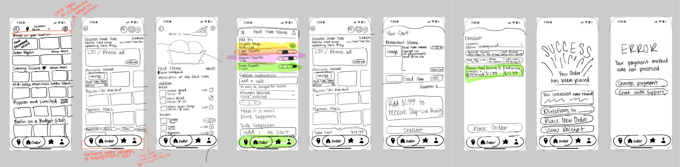
overview
Original Navigation
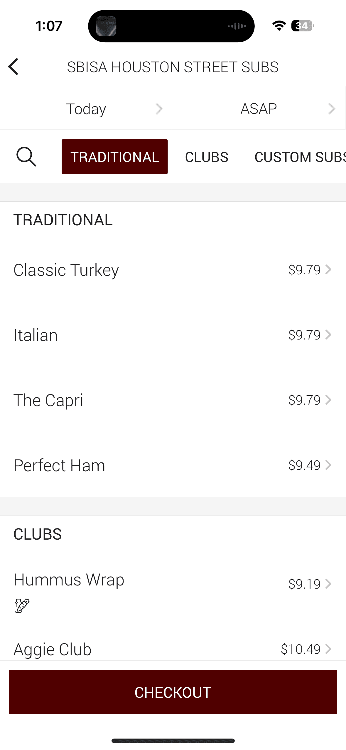
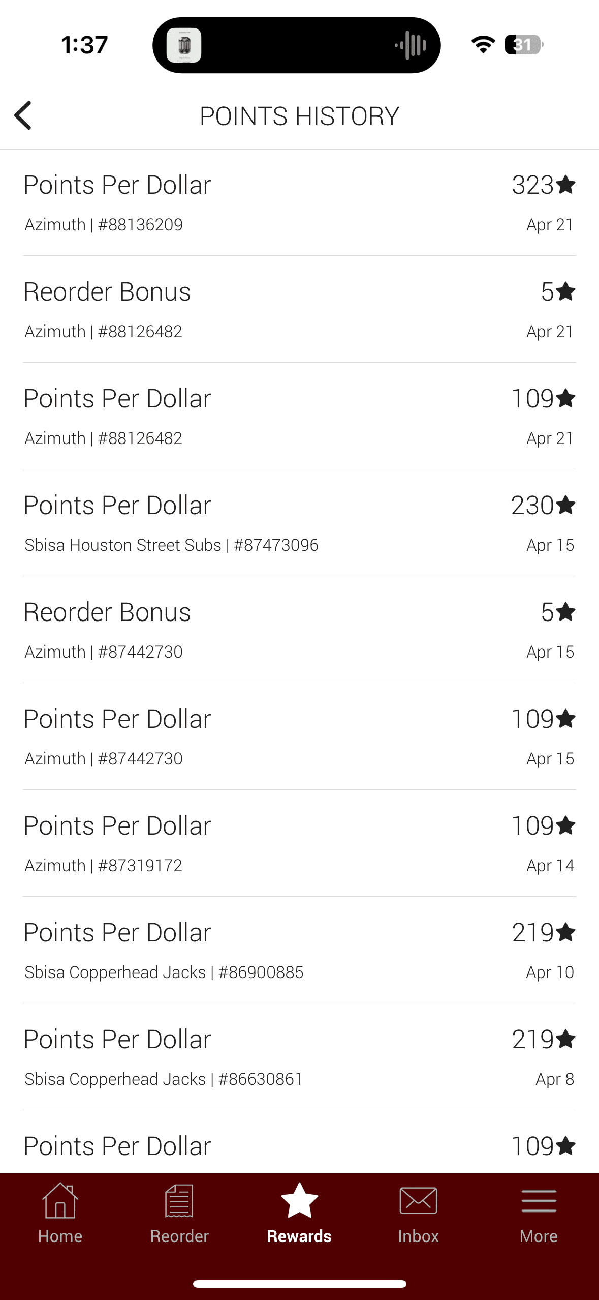
The current Transact app contains five main navigation pages:
Home, Reorder, Rewards, Inbox, and More.
New Navigation
In my user flow, I redesigned the five main navigations to be: Balance, Map, Home, Rewards, and Account.
I believe the new pages more accurately represent the expectations for what the user is intending to interact with and increases ease of use when navigating to different sections in the app.
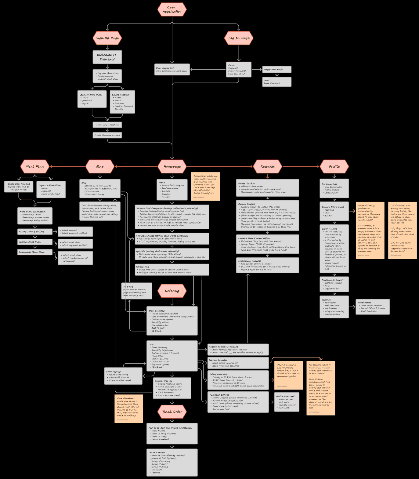
Meal plan balance
Quick Sign-In
Added a 'Quick Sign-in' or 'Auto Sign-in' feature to view their meal plan balance and maintain user privacy with two sign-in modes.
Spending Habits Tracking System
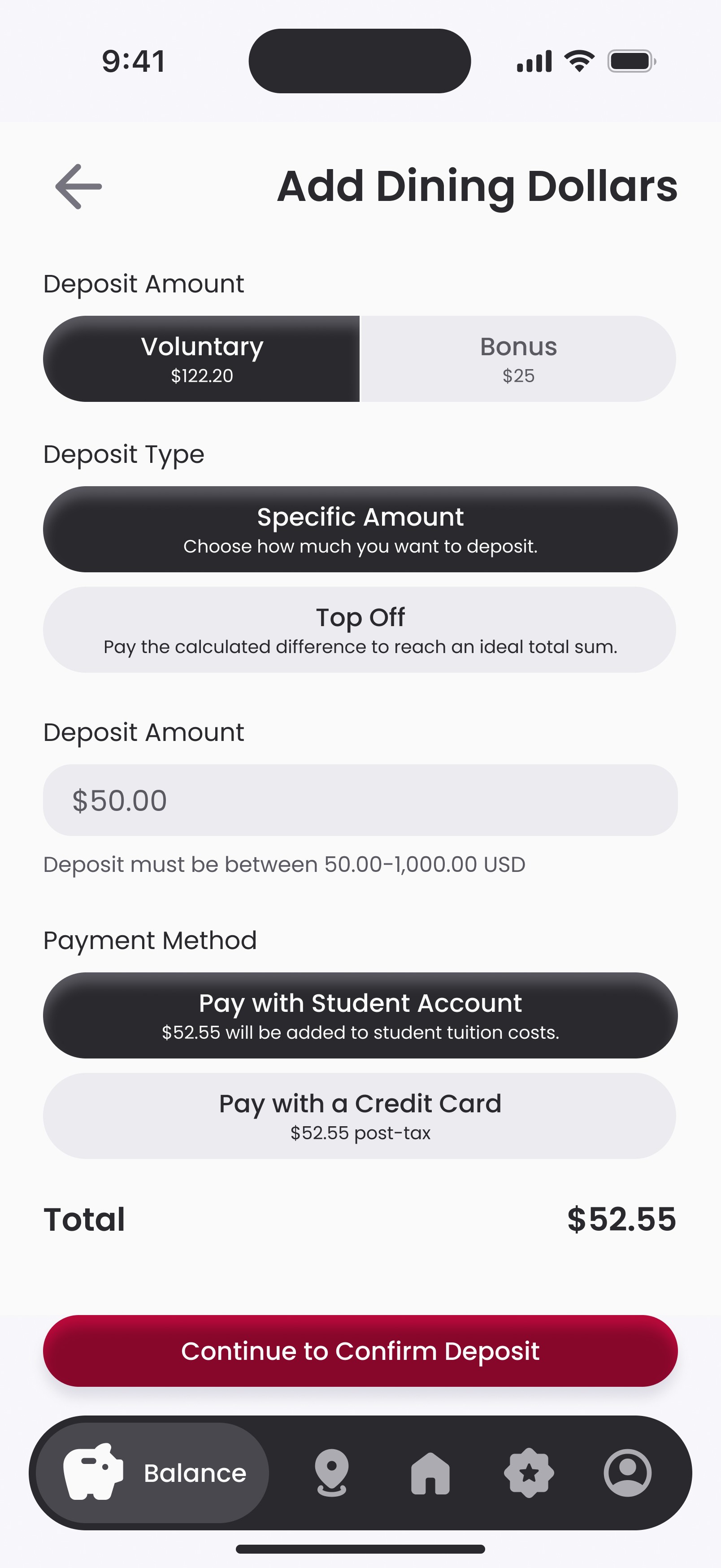
New dashboard overview of user's spending habits divided into meal plan payment categories that Texas A&M accepts when purchasing food. By allowing the user to view their spending in categories, it will hopefully inform them on future meal plan renewals and which plan works best for them based on their previous purchase habits.
Financial Add-Ons
Implemented a fund top-off in-app rather than requiring the user to leave the platform to add money.
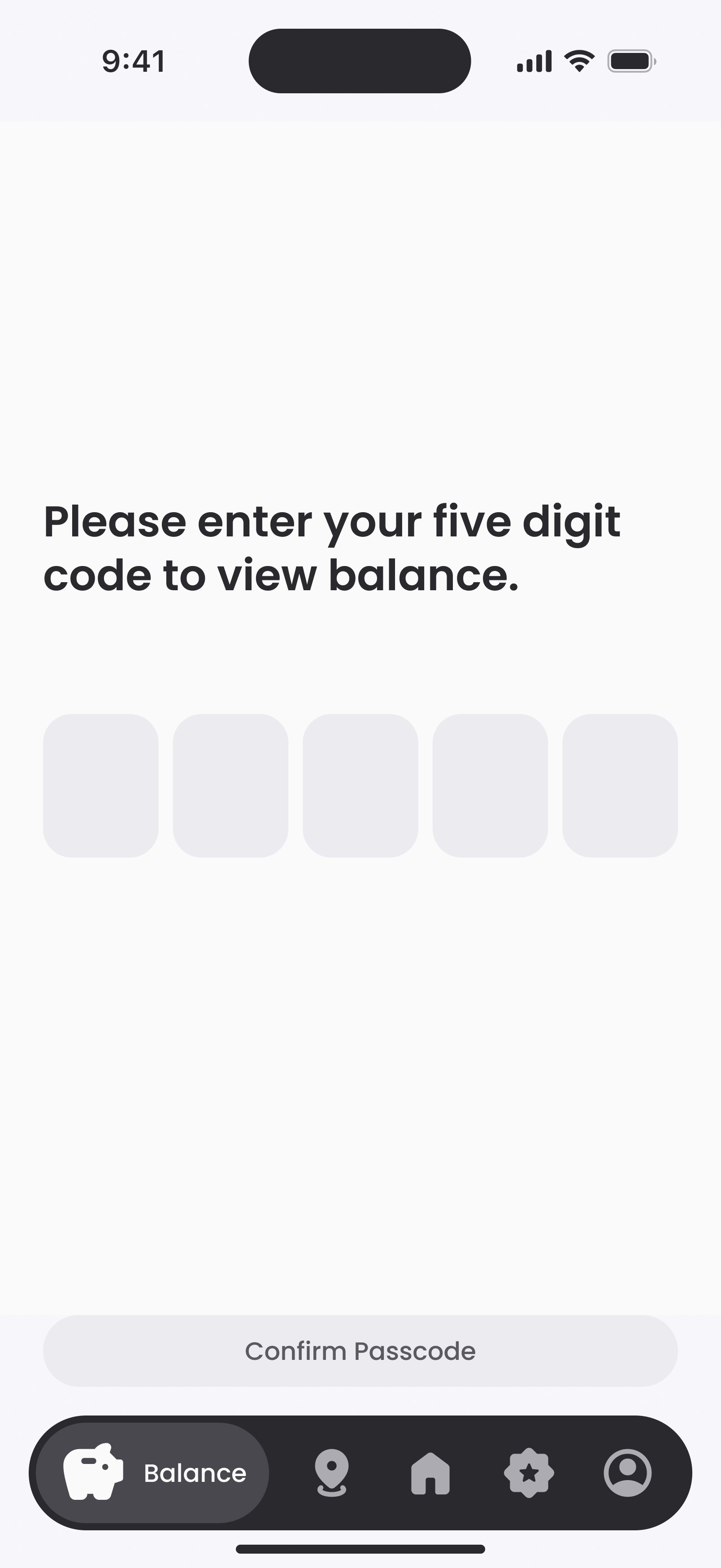
balance

Quick View Allowed
Bypass login & go straight to view
Login to Meal Plan
Email
Password
Allow Quick View?
Meal Plan Breakdown
Remaining Swipes
Remaining Maroon Meals
Remaining Dining Dollars
Reload Dining Dollars
Select Amount
Select Payment Method
Upgrade Meal Plan
Select Meal Plan
Select Payment Method
Downgrade Meal Plan
Select Meal Plan
Select Reinbursement (if applicable)
maps
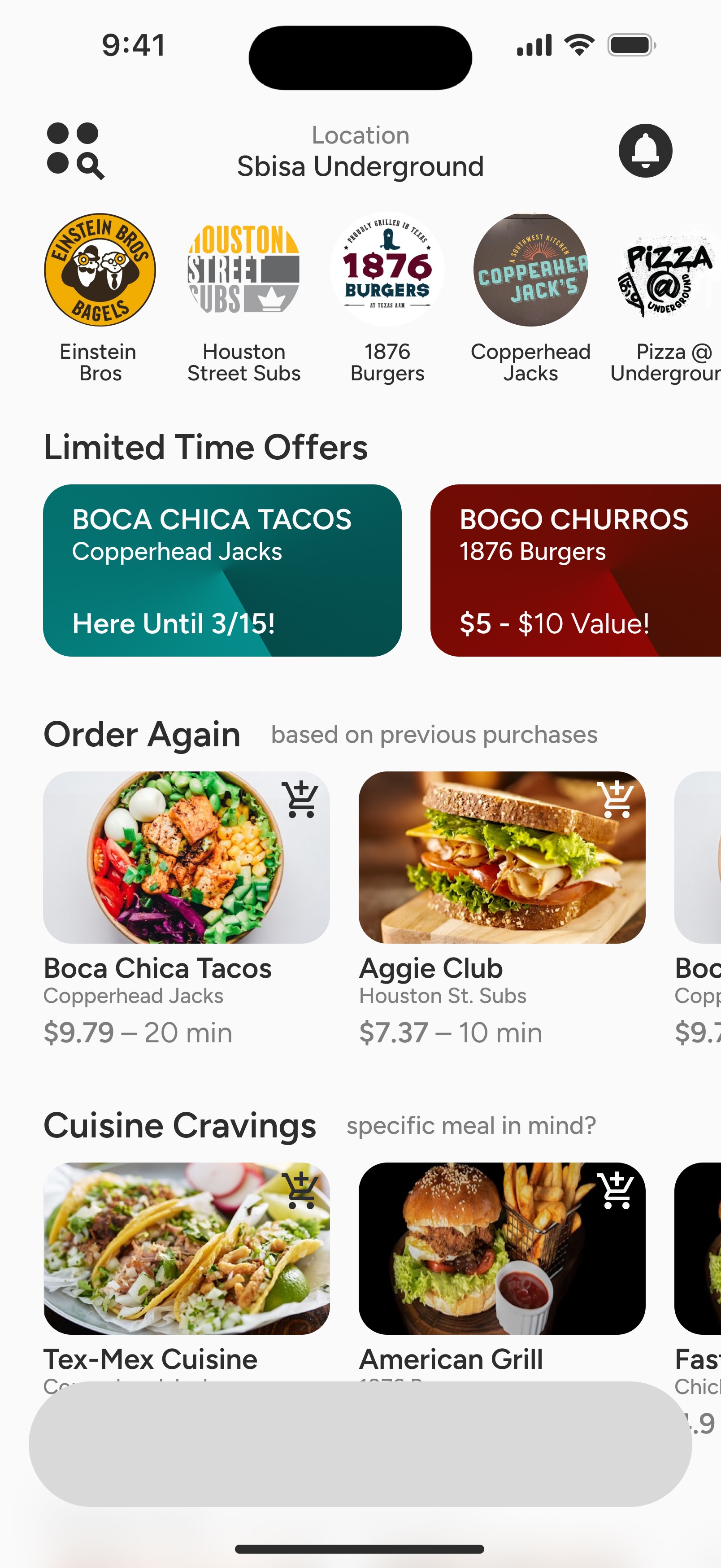
Advertised Meals
The app suggests meals in their approximate location that would be enticing to the user based off previous purchase history. If there is not a menu item purchased from the restaurant before, meals are recommended by popularity.
Added Location Hours
The current app does not highlight hours for dining halls, convenience stores, or cafes on campus, something the redesigned app implements.
Quickly Sort Locations
Users can quickly sort through the different types of restaurants on campus and view their locations which the current app is also unable to do.
Maps
Map
Zoomed in on user location upon opening
Meal pop-ups in different locations
Select Location
Can choose between dining halls, restaurants, and corner stores
* Dining halls and corner stores only show menus, no ability to order through the app
Select Meal Pop-up
* Dining halls and corner stores only show menus, no ability to order through the app
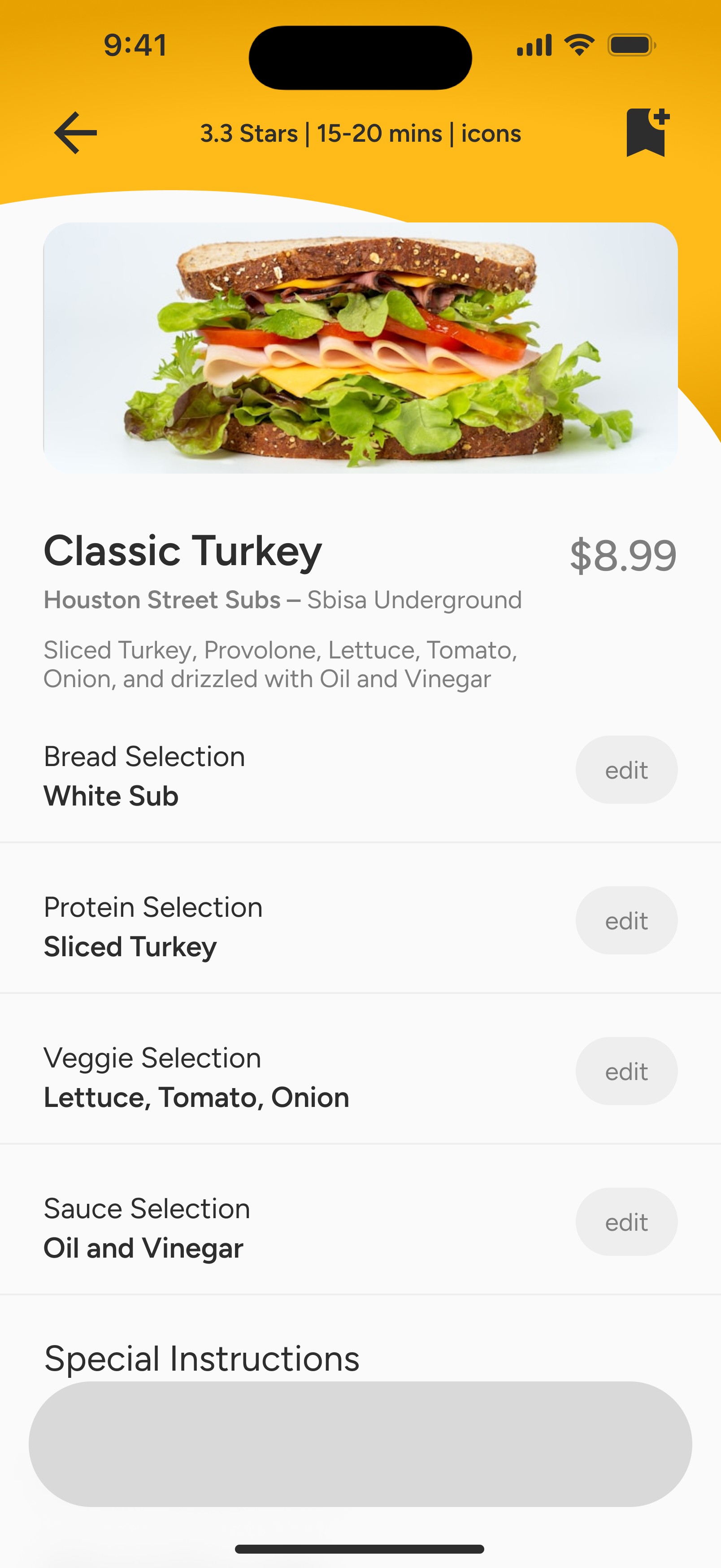
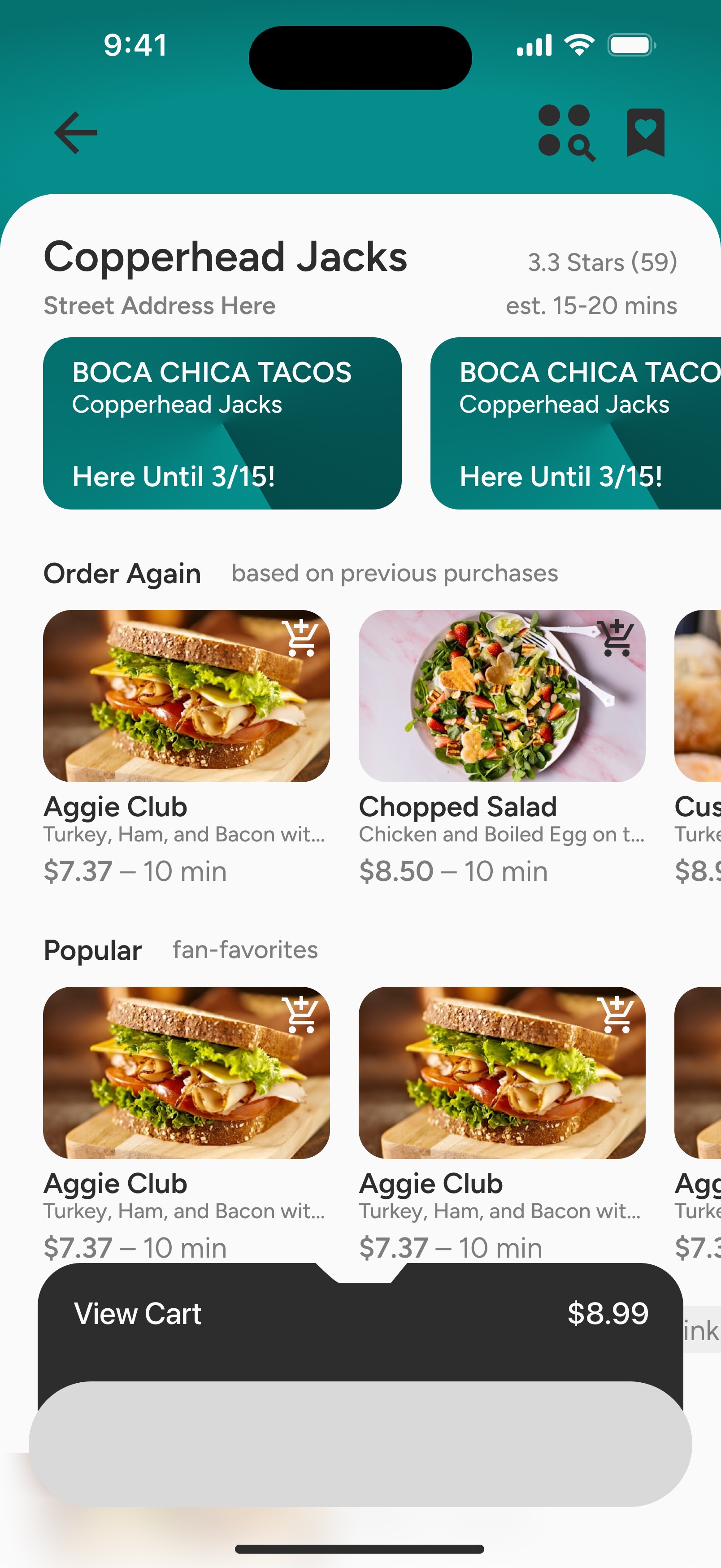
homepage & ordering
One Stop Shop
The current Transact does not show any menu items unless the user selects a restaurant first. The redesign contains an overview for menu browsing, highlighting meals available, sorted into different categories like ‘Order Again’ or ‘Speedy Eats.’
Streamlining Menu Browsing
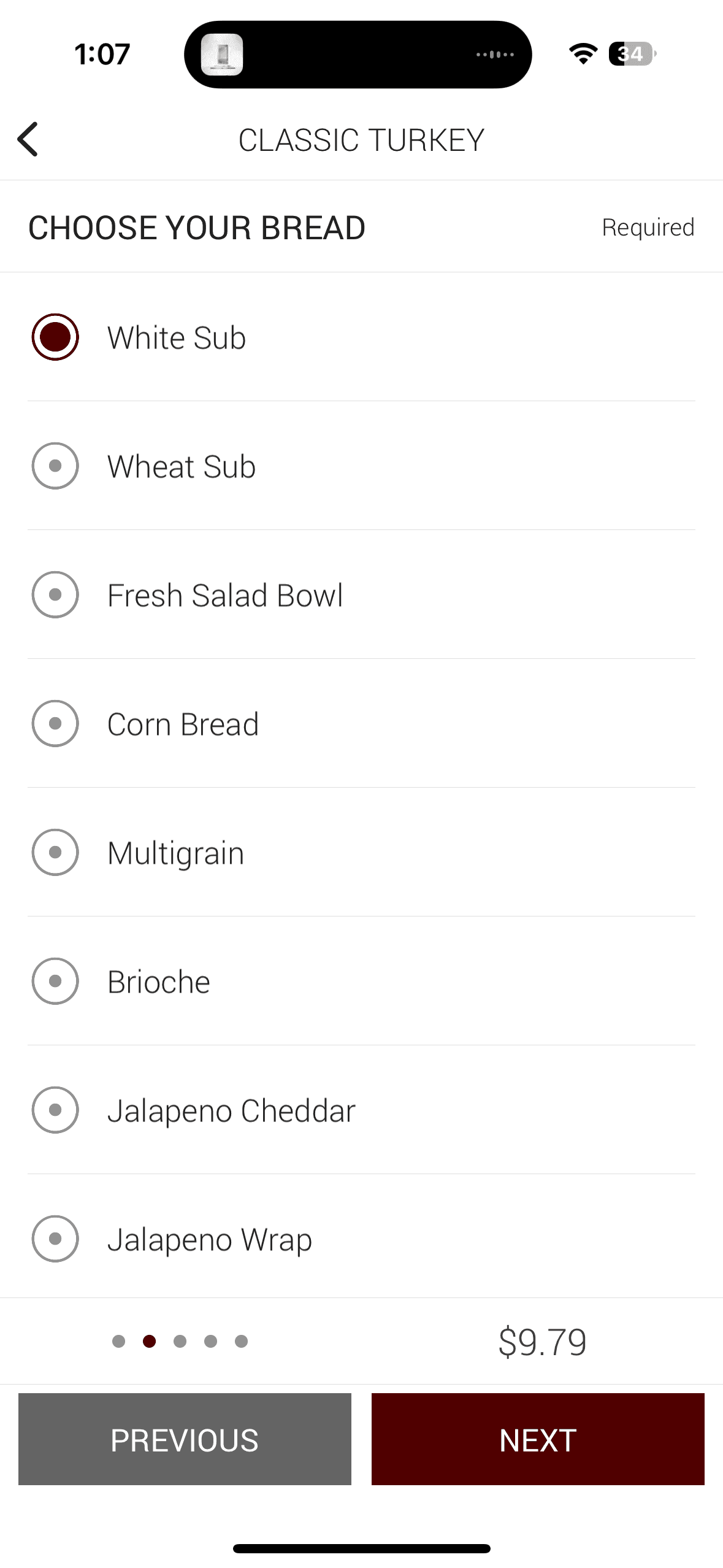
In the current app, users cannot view a food description without clicking on the food item first. The redesign allows users to view a restaurant’s menu with menu items' name, rating, brief description, price, and estimated time to prepare without needing to click on the item first.
Offers & Rewards
Any limited time promotions or discounts are also emphasized at the top of the screen to encourage the user to either take advantage of the deal or highlight the benefit of using the app over ordering in-person.
homepage
Menu
Browse Food categories
Available meals
Specials
Ordering
Re-order
Note:
Restaurants would all show address (actual and relative) and operating hours.
It could also have tags like 'affordable,' 'halal friendly,' etc.
Browse Food Categories
Location (sort close to far)
Cuisine Type (sandwiches, bowls, halal, health conscious, etc)
Familiarity (recently ordered or popular)
Estimated Time (shortest to longest estimation)
Price (can be done low to high or maroon meal applicable)
Search Bar also available
Available Meals
This would show specific food menu items
LTOs, vegetarian, snacks, desserts, highly rated, etc
Reordering
Shows food items closest to current location first
Ability to directly add to cart or edit previous order
Specials
This would show upcoming LTOs offered
It could also show promotions and rewards available to the user
ordering
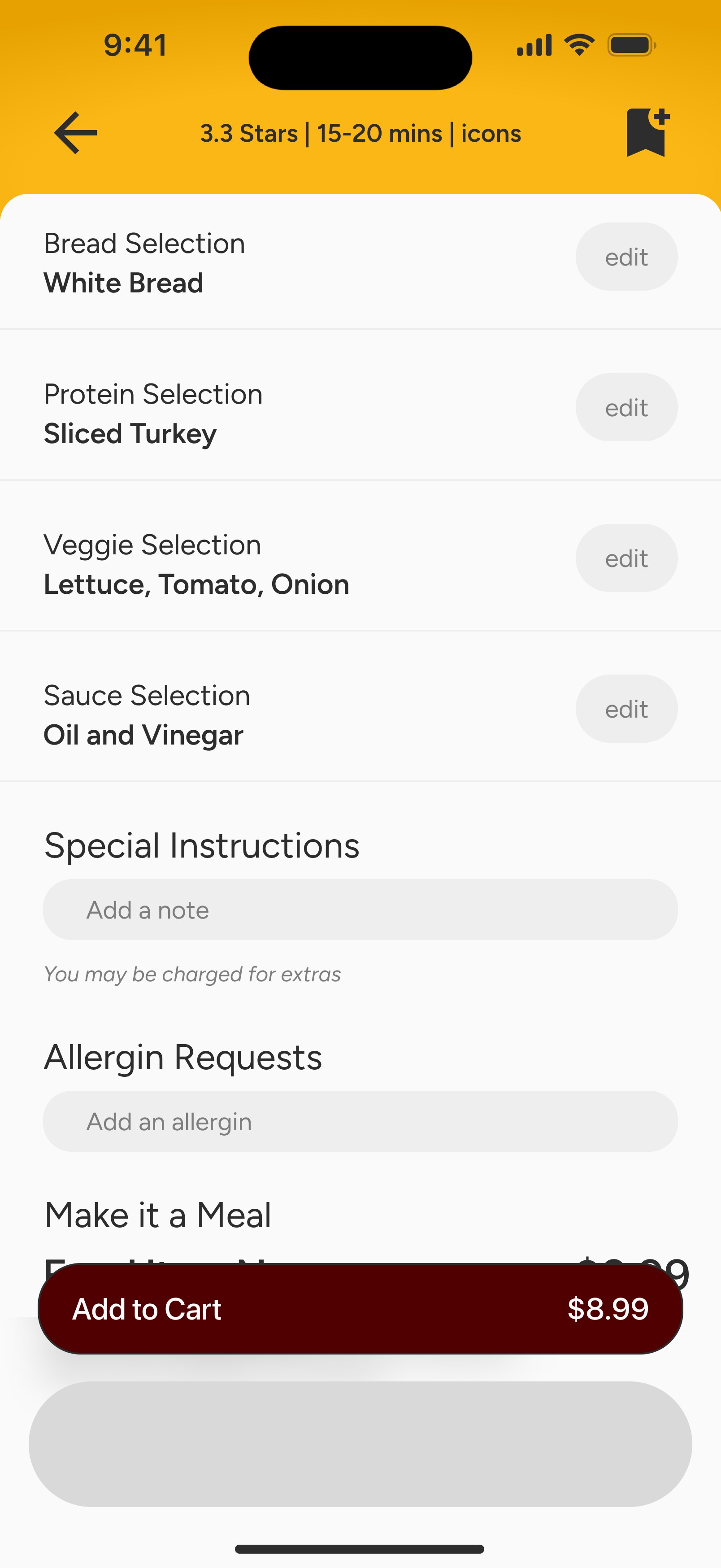
Items Selected
Shows description of item
Lists nutritional information
Customization options
Free response box
Add to Cart
Go Back
Note:
Restaurants would all show address (actual and relative) and operating hours.
It could also have tags like 'affordable,' 'halal friendly,' etc.
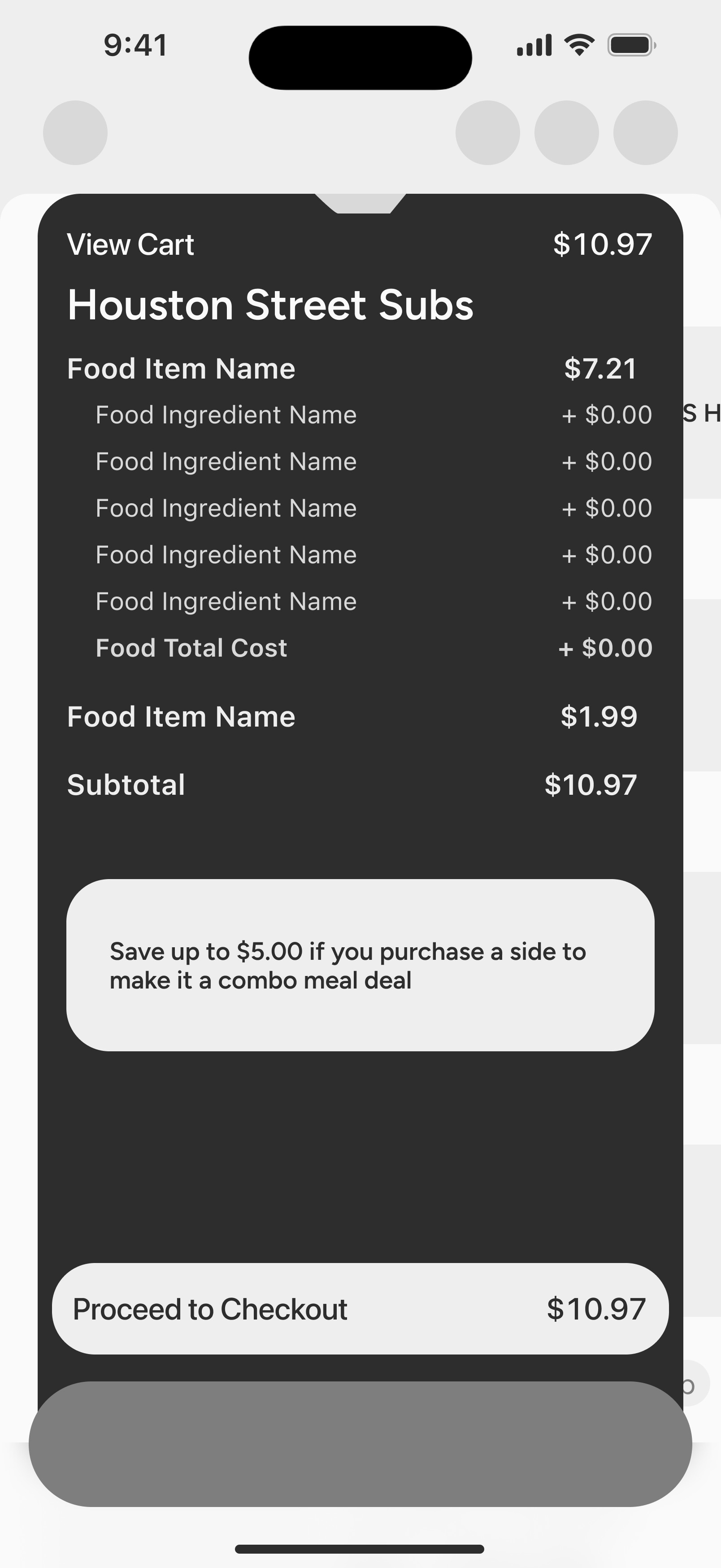
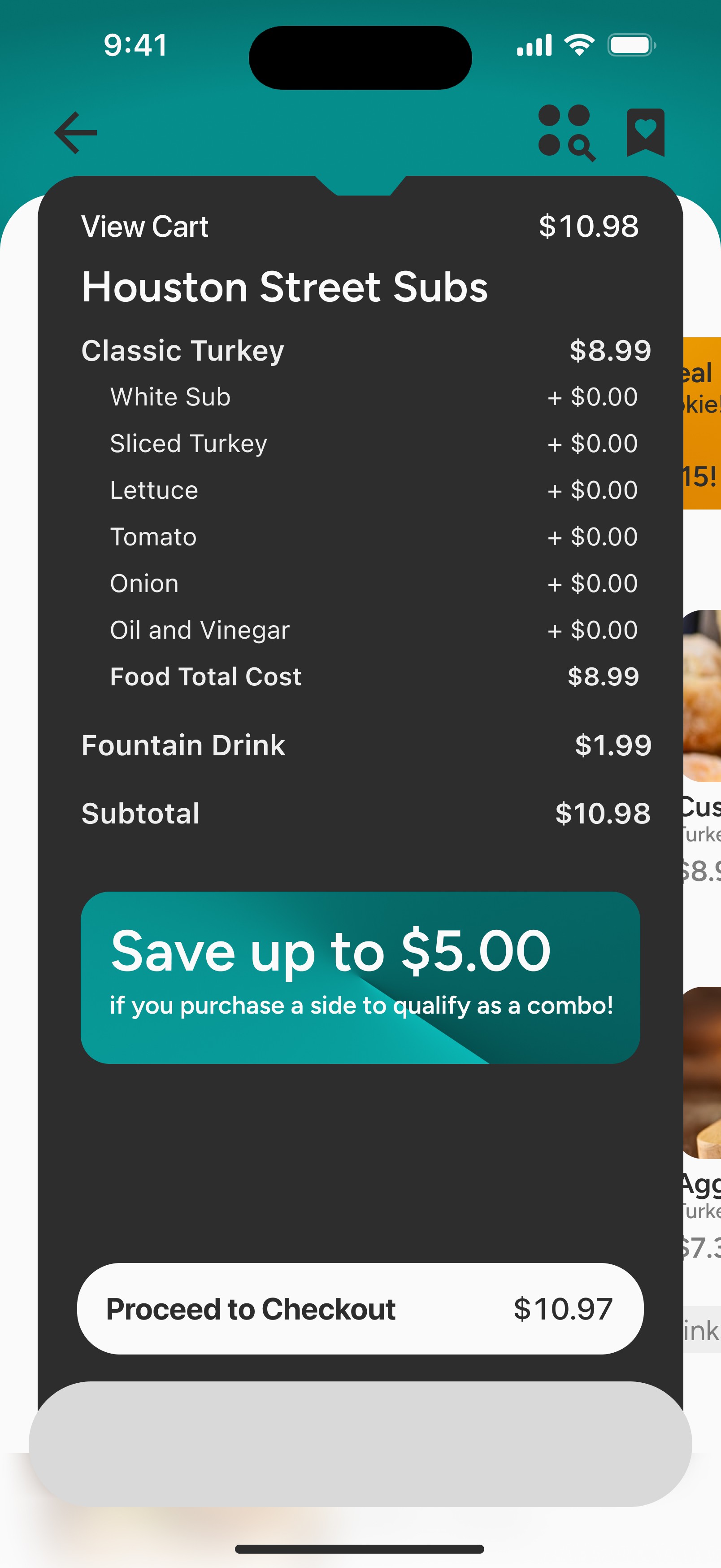
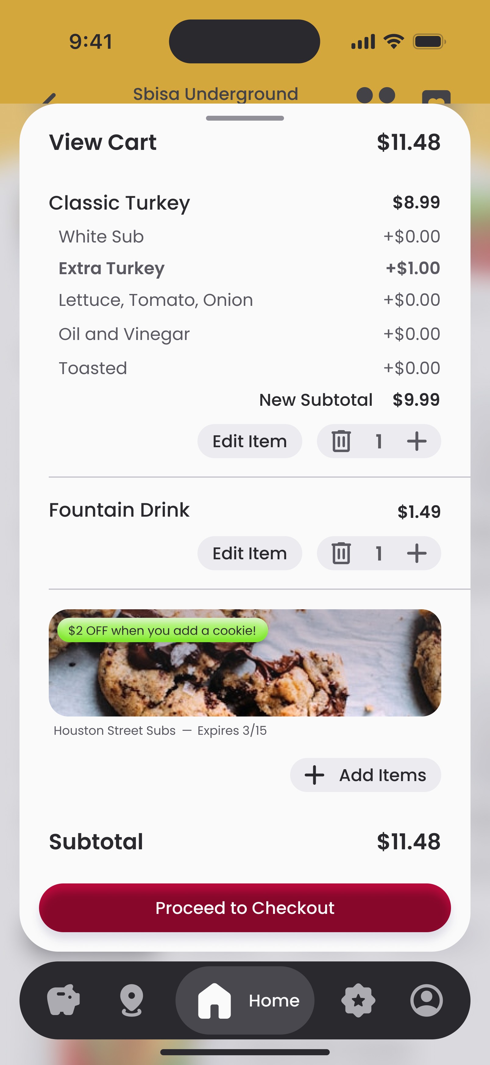
Cart
Order Summary
Quantity Adjustment
Redeem Coupons/Reward
Final Price
Confirm Location
Select Time Slot
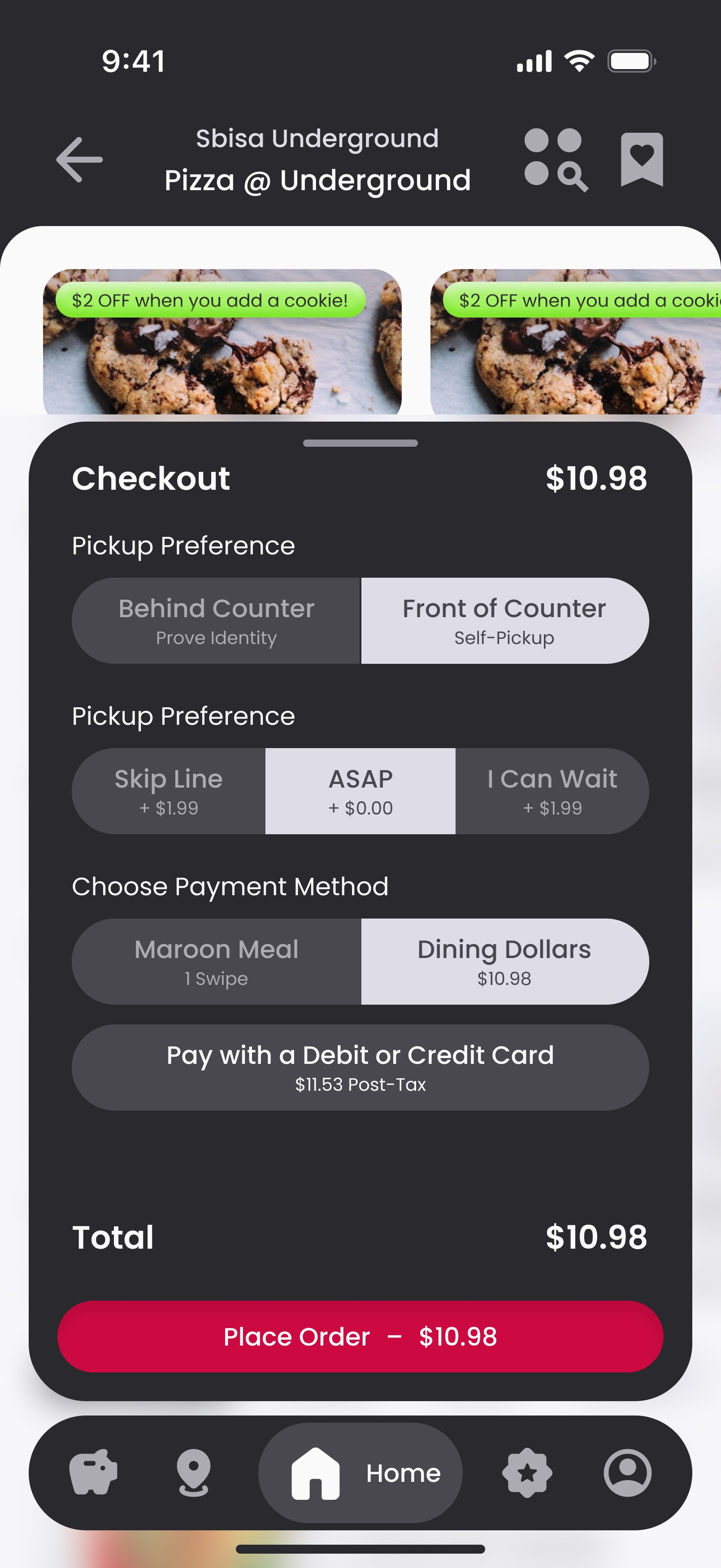
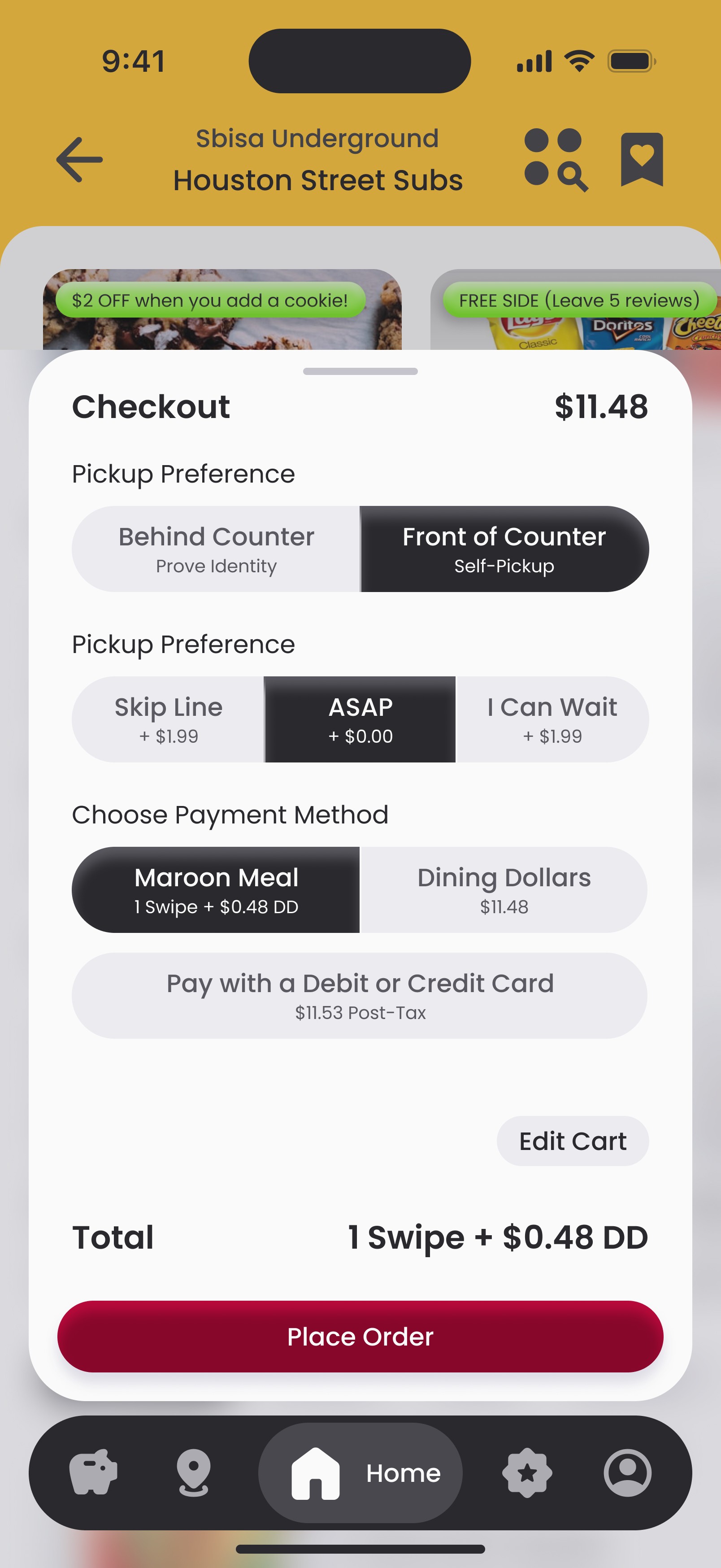
Checkout
Error Pop-up
What went wrong
Chat with support
Place a different order
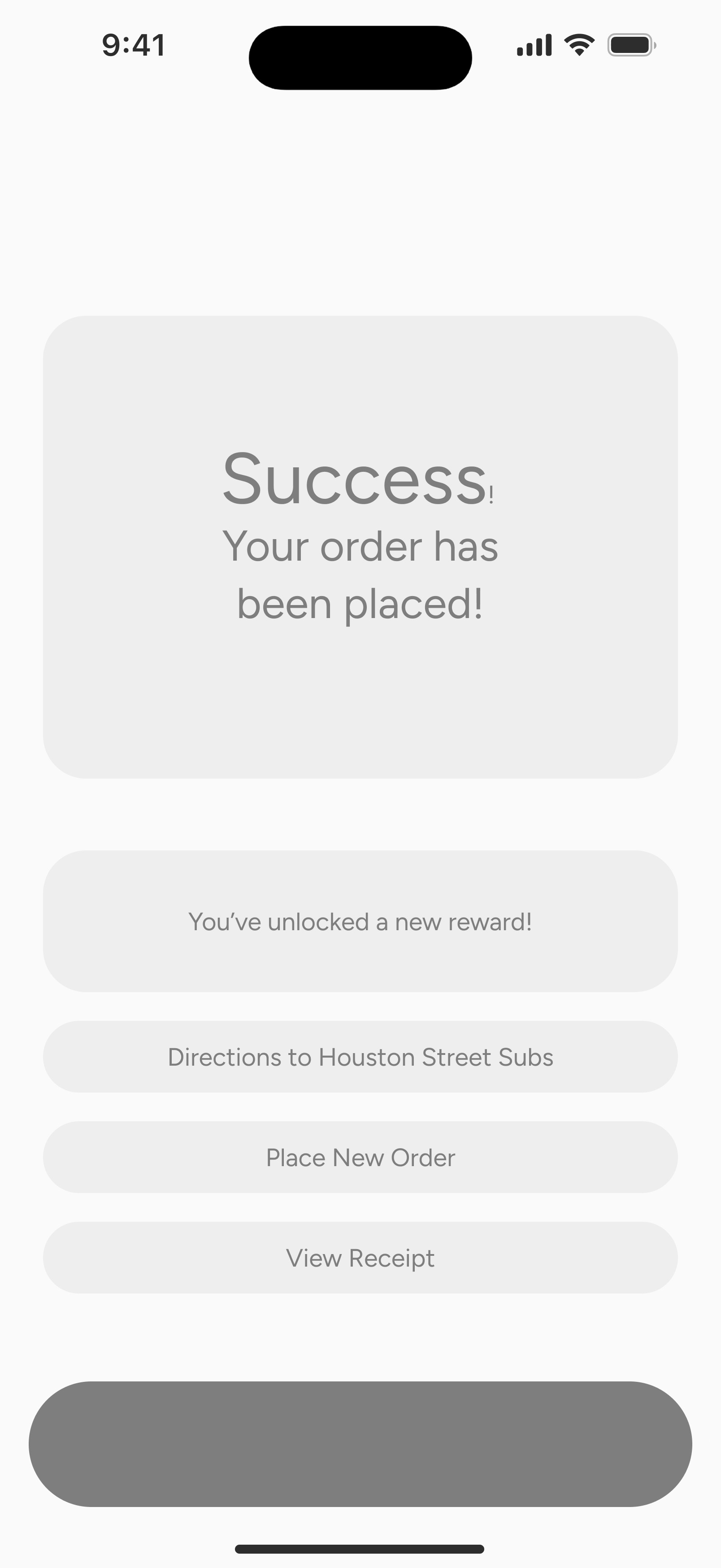
Success Pop-up
Online tracking begins
You've unlocked a new reward (if applicable)
Directions
Place another order
Directions
Would map them to the restaurant they placed their order at. If under a mile, default setting would be walking.
ordering
features
Select Time Slot
Priority (+$1.99) Wait time <5 min
ASAP (+$0.00) Wait time 10-15min
Time Slot (Intervals of 15min)
No Hurry (-$1.99) Shows peak downtimes
Note:
What if there was a 'pay for priority' feature like a skip-the-line pass at amusement parks.
Confirm Location
Shows closest location first
Shows remaining open locations
Note:
What if the user could select 'behind the counter' or 'on the counter'
Some students complain about food being stolen so 'behind the counter' would require identity confirmation before picking up food.
'On the Counter' would be for students who want to walk in and grab their food with no social interaction
Payment Options
Dining Dollars (shows remaining amt)
Maroon Meals (if applicable)
Meal Swipe (shows remaining & time reload)
Saved Card
Add new payment method
New Payment Method
Name on Card
Expiration Date
Security Number
Save Card
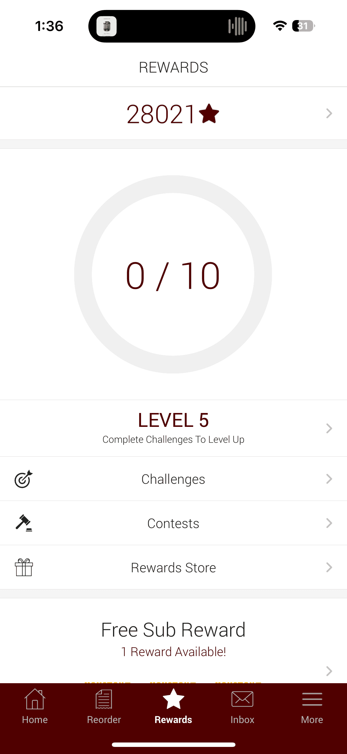
rewards
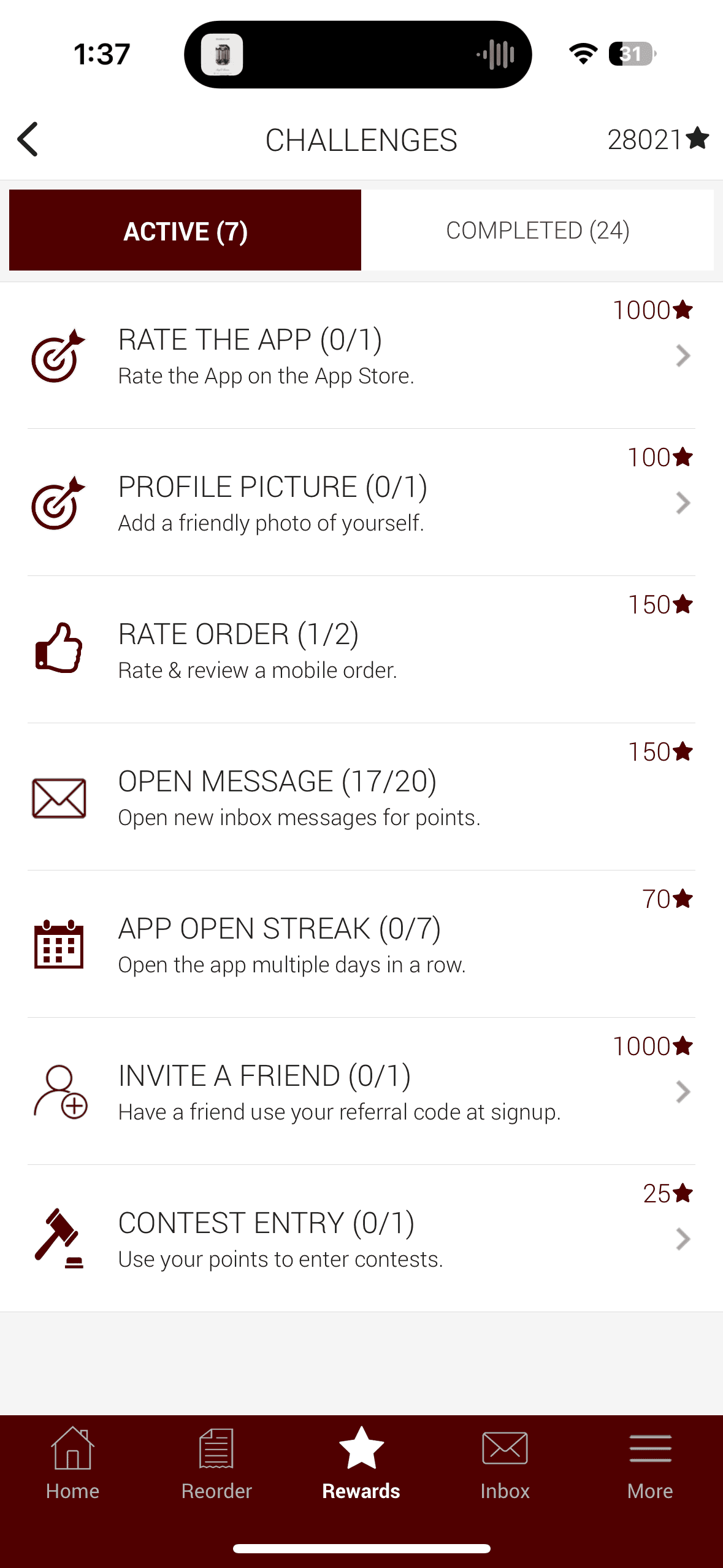
Making Transact Fun
The Rewards page has a completely new design, with gamification at the forefront. With students using the app daily or only once a month, the reward system needed to be enticing for both.
Gamified Badges
The reward system gives the user badges based off their purchasing history along with a free item in that same category. For example, students that only order a coffee once a month could earn the badge ‘Coffee Connoisseur’, which rewards the user with a free coffee for every 'X' number of purchases. In addition to the free coffee, they earn an illustrated badge in-app that is personal to their purchasing habits. The more the user purchases in the app, the more badges they collect and the more free food items they receive.
LTOs & Community Rewards
All other ongoing promotions and offers are displayed on the Rewards page.
rewards
Points Tracker
Different Checkpoints
Rewards available for each checkpoint
The rewards could be discounts or free items
Earned Badges
Coffee Connoisseur (10 coffees, free coffee)
Aggie Traveler (eat at every area of campus)
Meat Master (order xtra meat 5x, free xtra meat)
The badges are for ordering a certain quantity
The badge is earned once, but the reward renews each time quantity is reached
Limited Time Rewards
Valentines (BOGO Dessert)
Spring Break (50% off salads)
Cinco de Mayo (free churro with purchase of burrito bowl)
Ring Day (free onion rings with Aggie Ring)
Community Rewards
Free side for leaving 5 reviews
Discount for ordering for a friend with proof of tagging Aggie Dining on socials
Account
Making Transact Personal
The Account page is designed to be the backbone of the app. The user can select their dietary preferences or restrictions, which can automatically customize every food item offered to their needs.
New Auto Menu Adjustment
If a food menu item cannot be customized to fit the needs of the individual, it can be hidden to only highlight what menu items the user can eat. However, if the user is trying to buy a meal for a friend who does not have restrictions, the preferences can easily be toggled off and revert to the original format. As someone who has a lot of food allergies, the confidence I would gain to know every item shown on the menu is something safe to eat is monumental.
Transaction History
The Account page also keeps receipts for all purchases and rewards.
Account
Personal Info
User Information
Profile Picture
Contact Info
Note:
What if dietary preferences automatically customized the menu to meet their specific needs?
For example, if someone doesn't like mayo, all menu items containing mayo remove the mayo once the item is added to cart.
There is still the option to keep mayo if they are ordering for someone else.
Dietary Preferences
Allergens
Likes
Dislikes
Note Cont.
OR if someone has dietary restrictions, say halal, the food menu item names auto bold so they instantly know its safe
OR they could hide any menu items that do not meet the criteria of halal
OR the app shows customization options that can become halal
Order History
Can be sorted by restaurant or order date
If sorted by restaurant, page hides duplicate orders. However, if menu item is selected for further inspection, all purchase dates are shown
Displays reward redemption history
Feedback & Support
Customer Support
FAQs
Suggestion Box
Settings
Two-factor authentication
Notifications
Policy and Security
Cancel Account
Notifications
Order Status Updates
Special Offers & Promos
Meal Reminders
iterations
sketches
My whiteboxing process begins with sketching. I prefer to start on paper, as it allows me to quickly capture ideas and jot down notes. I also use my iPad to sketch, ensuring that my drawings match the exact dimensions of the intended screen size.
wireframes
Once satisfied, I bring these sketches into Figma and translate them into auto-layout wireframes.


lo-fidelity
From there, I input selected information into the screens to visualize how they appear with accurate content and imagery. At this stage, I adjust text hierarchy and sizing to define the overall look and feel of the app.


Design system
overview
After sketching and developing low-fidelity screens for the redesign, I began constructing the design system based on the low-fidelity aesthetics. I initiated this process with the buttons and progressively expanded to other components. Each element within the design system was made adaptable for both dark and light modes.
I also incorporated toggle and Boolean properties to manage options such as leading or trailing icons, the number of selectable choices, and button states. For interactive components, I ensured compliance with minimum WCAG standards for width and height. As I integrated the design system into my mid-fidelity screens, I expanded it whenever a new component variant required significant changes from its parent.
Additionally, I established a color variable system, assigning colors to specific design features like text, fills, and strokes. This approach maintained consistency in color usage throughout the app, particularly in establishing a clear text hierarchy.
Featured components
Below are only some components from my design system.
Color variables
Primary buttons
Light Mode
Button
Button
Button
Button
Button
Button
Button
Button
Button
Dark Mode
Button
Button
Button
Button
Button
Button
Button
Button
Button
Primary buttons
Selection Prompt
Button
Button
Button
Button
Button
Button
Selection Prompt
Button
Button
Button
Button
Button
Button
Selection Prompt
Button
Button
Button
Button
Button
Button
Selection Prompt
Button
Button
Button
Button
Button
Button
Selection Prompt
Button
Button
Button
Button
Button
Button
Selection Prompt
Button
Button
Button
Button
Button
Button
Selection Prompt
Button
Button
Button
Button
Button
Button
Selection Prompt
Button
Button
Button
Button
Button
Button
Quantity buttons
2
2
1
1
1
1
2
2
1
1
1
1
Horizontal tag scroll
Appetizers
Entrees
Sides
Desserts
Appetizers
Entrees
Sides
Desserts
Navigation bar
Balance
Map
Home
Rewards
Account
Balance
Map
Home
Rewards
Account
dilemma mitigation
cart & checkout process
Existing User Flow
While developing my design system, one of the key challenges I faced was redesigning the add-to-cart and checkout experience. The existing flow was cluttered, with scattered buttons and multiple unnecessary screens interrupting the user journey.

Considerations
Cart Location
Given that both Apple and Samsung tap-to-pay interactions rely on the bottom area of the screen, I aimed to incorporate that into my redesign.
Swipe Gesture
Both Apple and Samsung use swipe-up gestures to access payment cards—an interaction I sought to reflect in this experience.
Financial Transparency
Aggie Dining has several different dining plans for purchasing food. I wanted to ensure the user could compare different payment methods.
Design Dilemmas
Cart Transition
When wireframing, I discovered the Cart either did not have enough contrast with the Navigation Bar or awkwardly caused the margins of my screen to be inconsistent.
Cart & CTA Color
My initial sketches did not include color. When I created the Figma wireframing, I realized the legibility of the 'Cart' either contrasted with the background or caused the CTA to change color.


Solution
Cart Transition
I chose to detach the cart from the Navigation bar, ensuring consistent margins and resolving contrast issues between the cart and the navigation bar.
Cart & CTA Color
I chose a 'Transact Red' color for the CTA button to ensure legibility in both Light and Dark modes.
The cart functions as an overlay with a darkened and slightly blurred background for improved legibility.
Financial Transparency
The selections contain brief descriptions beneath each choice.
For example, it notes that using a Dining Dollar balance saves money by avoiding tax, whereas paying with a credit card increases the cost.

Meal plan access
Existing User Flow
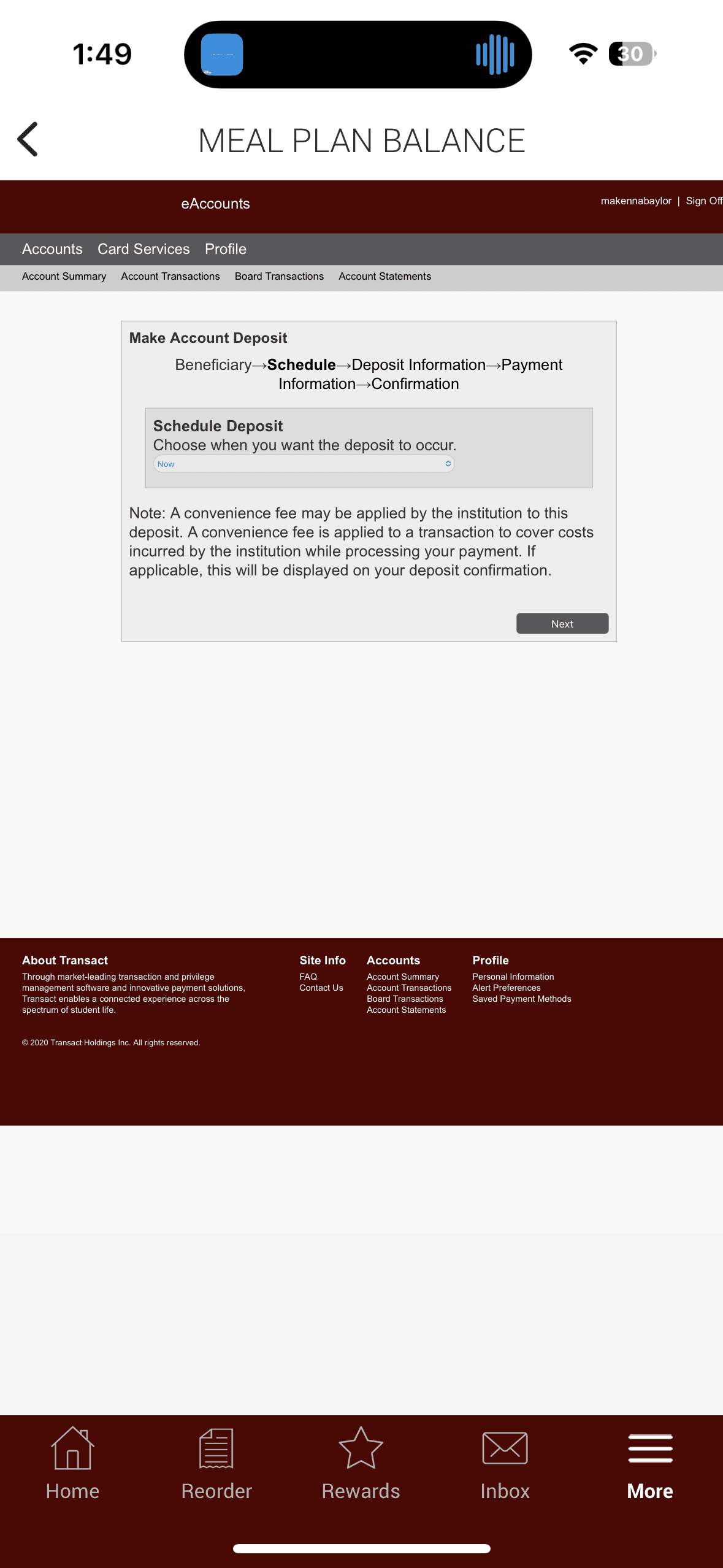
The current method to access the user's meal plan account is through the official Meal Plan website, shrunken down onto the phone. It fails virtually every accessibility guideline. Additionally, there is no quick way to view the user's balance without a dual authentication sign in.

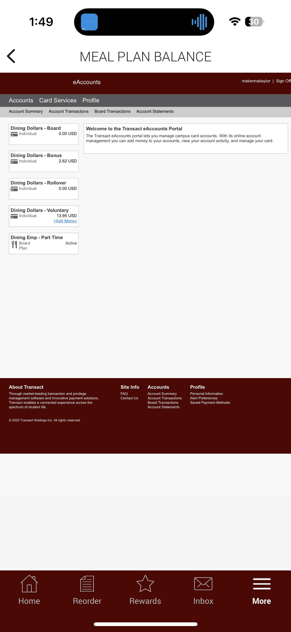

Considerations
Quick Access to Balance
The redesign needs to maintain security protocols to ensure the user trusts the apps, but can improve the time-on-task to access it.
Informed Transaction History
Users struggle to understand where their money goes, and why certain features like Maroon Meals do not work everytime.
Improved Legibility
The interface needs to be readable and maintain the same design system of the app.
Design Dilemmas
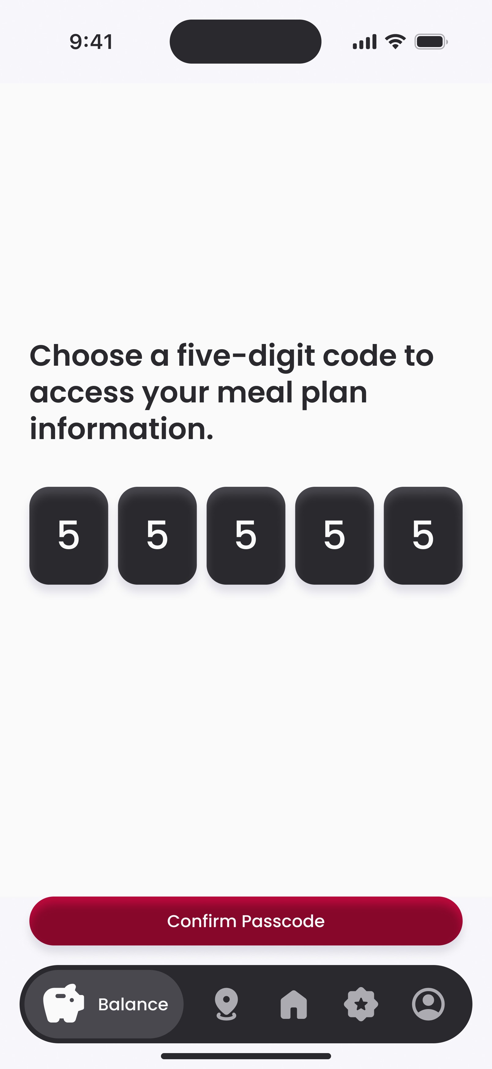
Security
I chose to implement a PIN for accessing the Balance page, drawing inspiration from financial apps that use PIN authentication on mobile rather than a full sign-in. However, I allow users to view their balance without a PIN since, if they can purchase food without verification, they should also be able to view their balance without additional steps.


Transaction Information
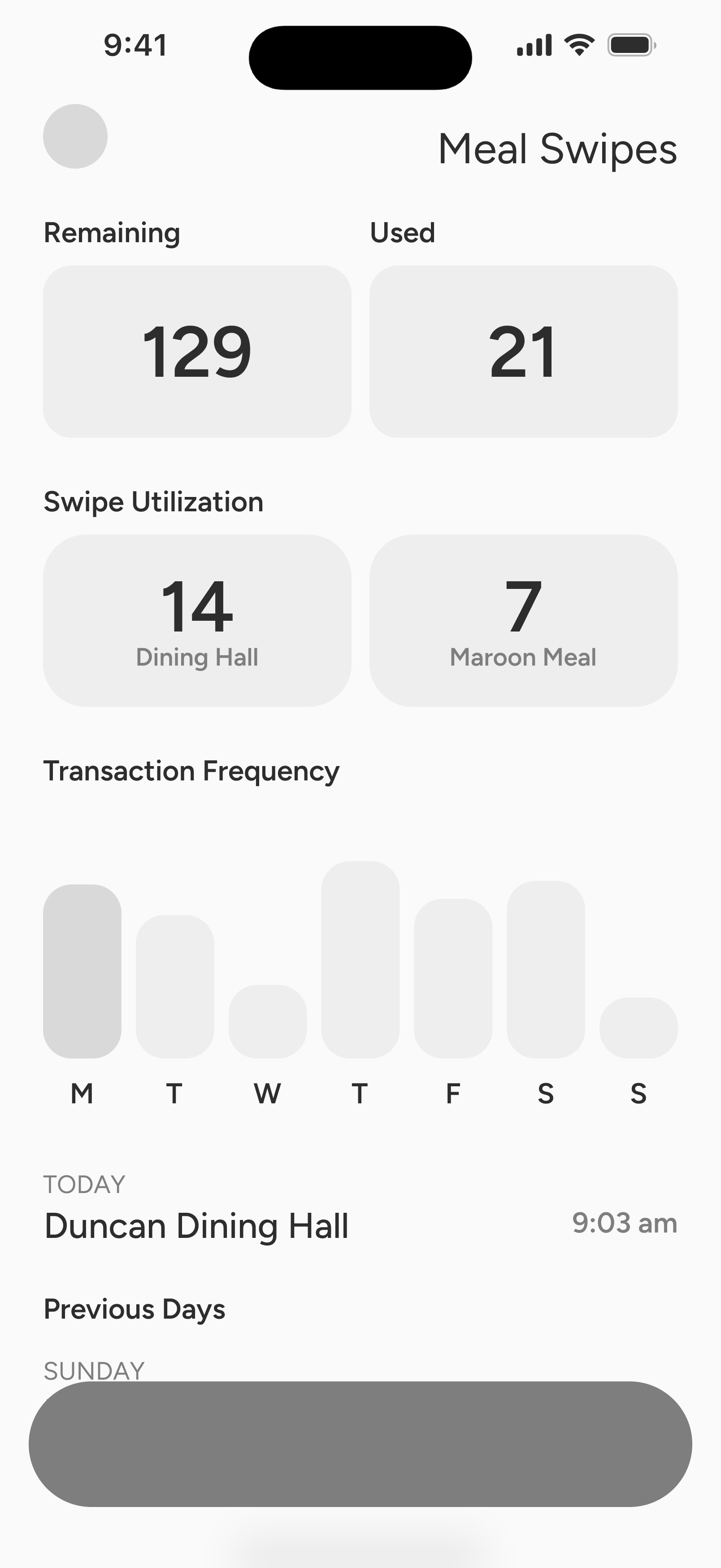
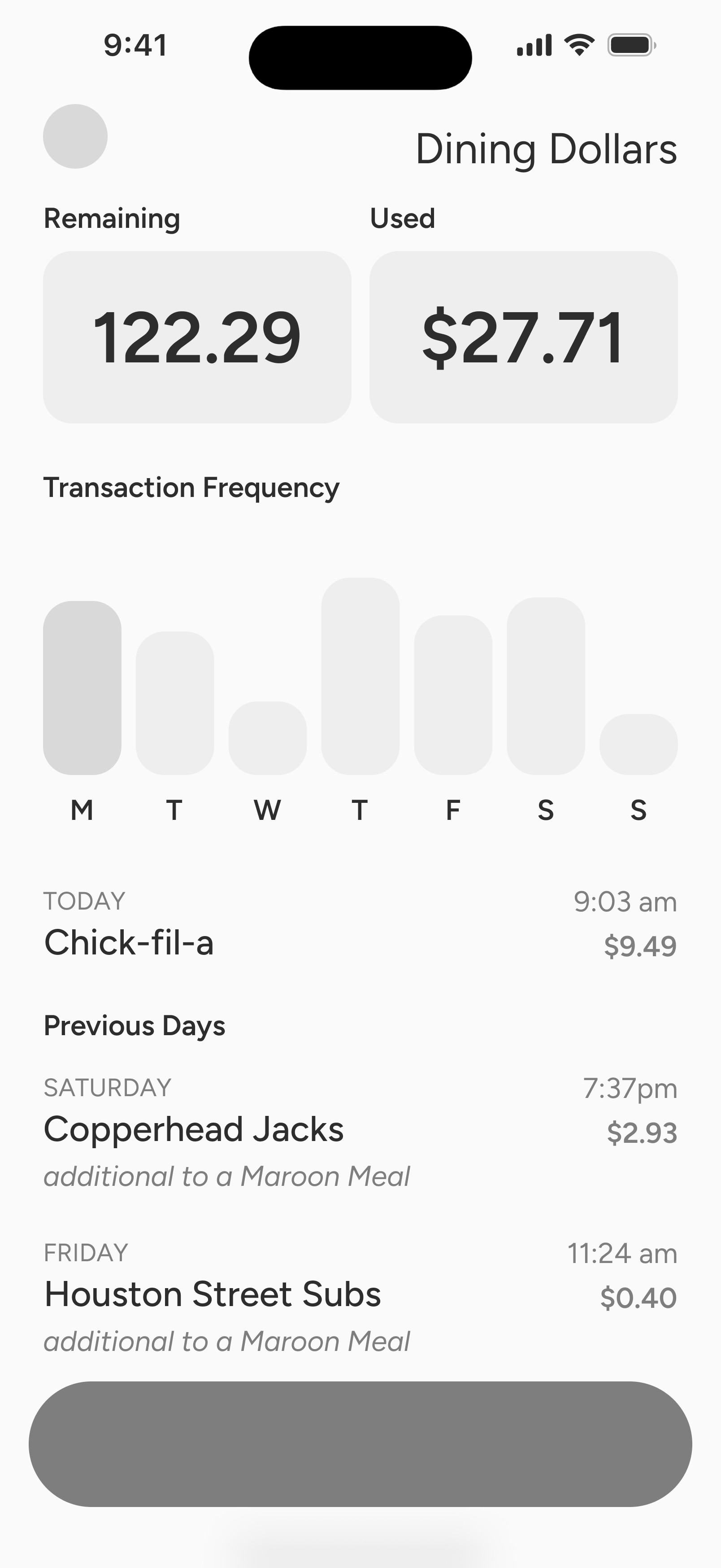
I chose to provide a breakdown of each purchase type due to the varying requirements for different transactions. For example, Maroon Meals fall under Meal Swipes but have specific rules, such as being limited to once every 30 minutes. Many students are unaware of these restrictions, leading to frequent complaints each semester. Clearly outlining each type and its unique limitations helps address this confusion.


Solution
Quick Access to Balance
The user can now choose whether their Meal Plan balance is visible upon opening the app or requiring a quick code to enter.
Transaction History
The main page shows all remaining balances and when purchases have been made.
Clicking on any of the red buttons allows the user to learn more about their purchase history.
Legibility
The meal plan is now able to be accessed, reloaded, and cohesive within the app.

gamified rewards
Existing User Flow
The current rewards system is confusing, with points being unexplained and little
Considerations
Quick Access to Balance
The redesign needs to maintain security protocols to ensure the user trusts the apps, but can improve the time-on-task to access it.
Informed Transaction History
Users struggle to understand where their money goes, and why certain features like Maroon Meals do not work everytime.
Improved Legibility
The interface needs to be readable and maintain the same design system of the app.
Design Dilemmas
Security
I chose to implement a PIN for accessing the Balance page, drawing inspiration from financial apps that use PIN authentication on mobile rather than a full sign-in. However, I allow users to view their balance without a PIN since, if they can purchase food without verification, they should also be able to view their balance without additional steps.
Transaction Information
I chose to provide a breakdown of each purchase type due to the varying requirements for different transactions. For example, Maroon Meals fall under Meal Swipes but have specific rules, such as being limited to once every 30 minutes. Many students are unaware of these restrictions, leading to frequent complaints each semester. Clearly outlining each type and its unique limitations helps address this confusion.
Solution
Quick Access to Balance
The user can now choose whether their Meal Plan balance is visible upon opening the app or requiring a quick code to enter.
Transaction History
The main page shows all remaining balances and when purchases have been made.
Clicking on any of the red buttons allows the user to learn more about their purchase history.
Legibility
The meal plan is now able to be accessed, reloaded, and cohesive within the app.
user preferences
overview
Subsection
Featured components
Subsection
final solution
home page
overall layout
Subsection
order process
Subsection
balance
quick view
Subsection
purchase history
Subsection
update balance
Subsection
maps
New Locations
Subsection
suggested meals
Subsection
rewards
Badges
Subsection
Promotions
Subsection
Social Rewards
Subsection
account
User Preferences
Subsection
Purchase history
Subsection
Results
statistical impact
Due to a client conflict of interest, my Transact redesign was not implemented. However, drawing from data-driven research and established user statistics, I anticipate my redesign would achieve the following results:
30-50%
increase in engagement from users from implemented gamification
60%
potential increase in user retention from personalization & gamification
30%
improvement in customer ratings based on personalization efforts
25%
increase in order conversion rates through tailored recommendations
10-20%
decrease in cart abandonment through streamlined order process
30%
increase in conversion rates from more locations offered
my takeaway
This project enabled me to deeply engage with a specific user group and address authentic pain points. Throughout the process, I rigorously questioned initial concepts against the practical needs of users. Despite having personal design preferences, I ensured the final outcome adhered stringently to WCAG standards. Although my full redesign was not ultimately adopted to improve Texas A&M students’ user experience, several of my recommendations were incorporated into the current app.
For instance, a special reward for a free sub sandwich after three purchases was offered. While my gamified reward badges were not implemented, the underlying concept of incentivizing users based on purchase behavior was embraced.
next project
impart
